nevasport.com: UX/UI design project
Context:
Nevasport.com is the most important hispanic speakers snow portal. The site was founded in 2001 by Pepe Peinado who thought about the idea of an online skiing sharing space.
The principal section is a forum where skiers can follow and comment on links that they are interested in, related to: technology advances, material, snow trips, ski resorts…There is also a skiing feed with updated news about the sport.
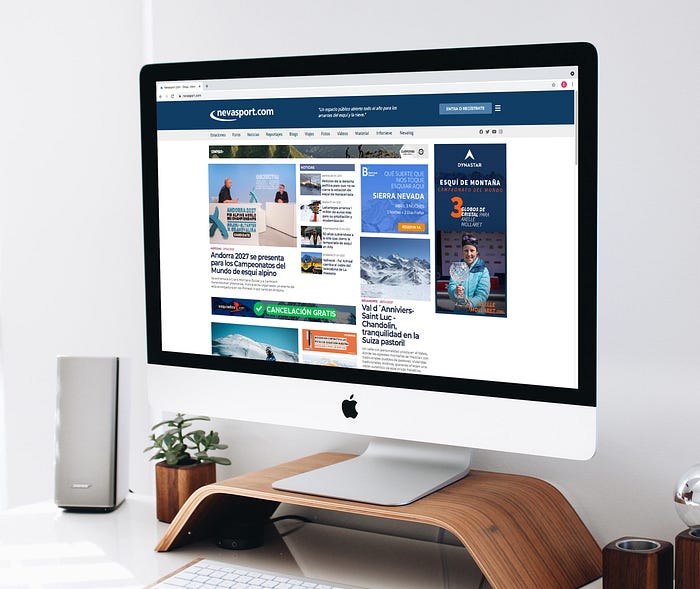
Nowadays, nevasport.com receives around 400.000 visitors per day, having the most traffic during the winter season. Considered as the leader of skiing media, users’ sign ups increase suddenly.
My role:
As a UX/UI designer, I decided to research the traffic inside the portal, visitor behaviour, frustrations and expectations, keeping the architecture of information and user flow in mind. My goal was to focus on attracting more advertisers, business problem solving, and improving skiers digital experience.
Timeline:
Organizing and visualizing the status of each process was essential before starting this research. Through The kanban method I was able to manage the project having a more unerring deadline control, using an agile methodology.

Timeline: 3 weeks
Research: 2 weeks
UI Design: 1 week

My hypothesis:
What do users need, indeed?
Skiers are in general a high economical target with technological access facilities. For that reason, They usually are connected with Apple products and new IOS trends.
Those kind of users love sharing their snow experiences when They are on the slopes, recording videos, posting pictures and Instagram Stories… Several pieces of information about the ski resort, forecast, material rent locations, or snow status, are also searched during the skiing journey.
Are there any business barriers?
Banners that show the website are not improvements enough for portal maintenance.
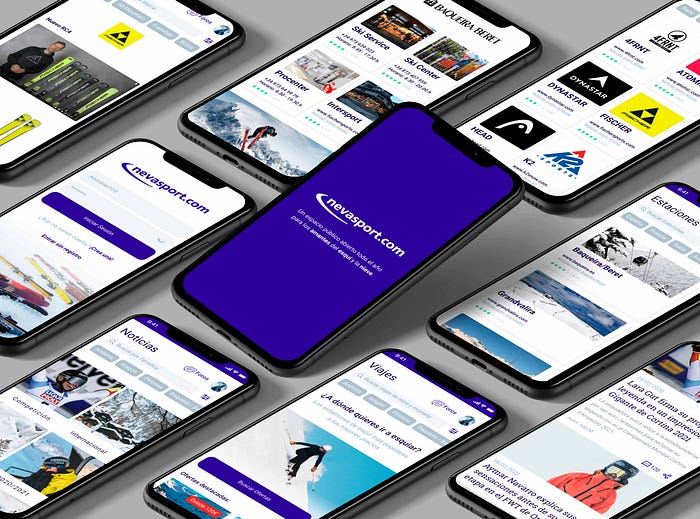
Maybe nevasport.com will need to develop an application which includes news, a forum (free contents for users), and a wide space for advertisers whose investments keep the skiing platform going. They need more visibility and interactions than simply a click on a banner.
I guess that an App where users can book skiing lessons, travel packs, rent material, or buy the ski-pass directly could be a huge business step forward.
Are these affirmations correct or am I getting it wrong? Let’s research!
What is happening in the Spanish snow market?:
- Direct competition: The number of Apps in the sector are rapidly increasing to solve skiers demand.

Usability tasks:
- User persona: It helps me to understand and emphasize with the real user by means of imaginary archetypes.
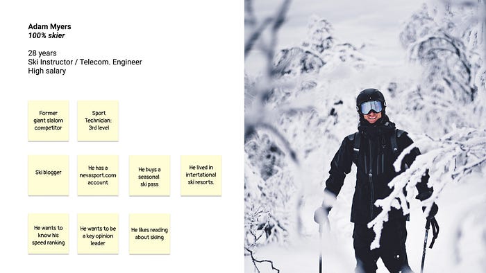
- Proto-Journey: I resorted to this exercise with the intention to validate my assumptions about the user persona behaviour, finding strengths and weaknesses.
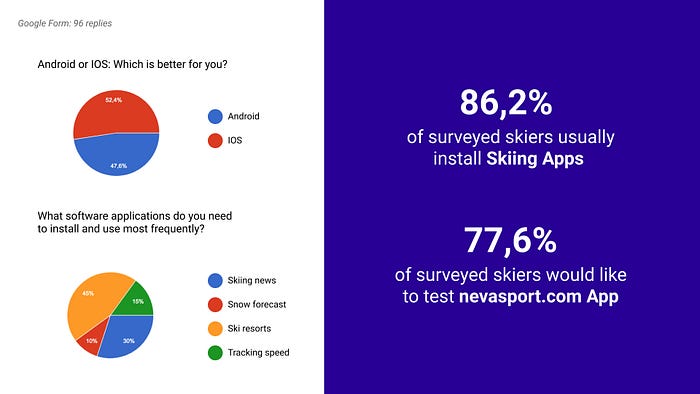
- The Lean Survey Canvas: this tool makes an easier question structure for the survey. I had to formulate my general ideas:
What do I need to learn? Who do I need to learn from? What information do I know already? How do I reach these people? - Survey form: Asking the real users to corroborate/modify my hypothesis and discover new proposals and points of views. A Google form was sent to a specific skier target.
- Personal interview: What does the CEO have in mind about improvements? What kind of barriers are there?
- Affinity Diagram: After these previous research tasks, I discovered the need to restructure, identify and rank the information collected. I recorded the ideas in different cards, organized in groups, considering the information resources.
This exercise helped me to refute or validate my hypothesis. - Job Stories: It helps searching for user motivations, expectations and emotional states, discovering functionalities.

- Functionalities:
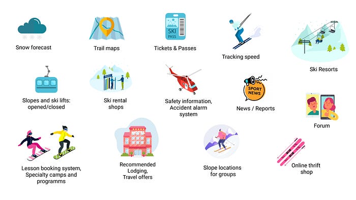
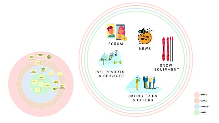
- Finding the core: Throughout this exercise I kept the functionalities list and the budget in balance finding the Minimum Viable Product. I had to be realistic and honest evaluating the current possibilities. An accurate selection of functionalities was elected in this step of the research.
General conclusions:
- To develop an Application
Despite the high cost and evaluation of the research results, I stand by it when I say “It’s the perfect tool to increase business volume”. Users could find two predefined blocks: news and forum without adverts, and a service space provided by advertisers. In addition, nevasport.com could grow and adapt to the current technological demand. - Functionalities:
My perception was changed during this research. There was a wide variety of functionalities like tracking speed that I considered interesting for the user but I was not focusing on the real problem.

- Users :
To prevent users from switching apps linked to the main skiing services and to each ski resort separately is a useful solution. Likewise, users can find specific and organized information faster; weather, lodging, equipment rental shops, brands updates, opinions, etc. They usually are proactive surfing on nevasport.com but it’s so important that they don’t emigrate to other Apps due to technological facilities.
They can book lessons, equipment and lodge, or read recommendations about travels or snowing areas immediately, always being in contact with other skiers.
Information Architecture (IA):
I had to think about a useful site map whose structure was ordered and clearly labeled. Without an organizational chart, which define different interactions levels, users could be frustrated and lost.


Stylescape:
A minimalism visual style was create before starting the prototype step. Emanating from nevasport.com guidelines, this document bring us to design elements and how it’ll tie between.

Visual references:
Discovering and collecting similar projects to understand how other professionals resolve design problems, is an essential exercise. I’m always willing to learn and get some inspiration.
Wireframes: Low-Fi
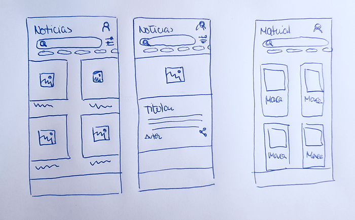
Sketching process permits us to find an effective route and a quite error recognition. I draw each app section defining the modules and its interactions.
- Forum: To program this section is so expensive and It’s not a lean solution.
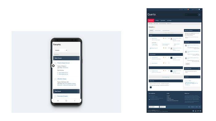
What could I sort it out? I decided to research about a technical alternative. My proposal was to introduce a predefined responsive forum template inside the Application.
Quarto: this forum software could adapt main colours and design structure.
Prototype:
- Grid system: 2 columns
- Design tools:

- Testing: Some tasks to resolve were prepared with the objective to find user flow gaps.
Next steps:
