UX/UI Project

Context:
Motorcycle clubs whose culture inspires disruptive ways of life, are often labelled as rebels against the system. Beyond the west coast choppers and cinematographic savage topics, this project focuses on finding a digital product that enhances the riders’s gaps on the road.
What type of motorcycle groups can we find nowadays? What communication channels do the riders prefer for getting in touch? How are they linked to the technological facilities? How they usually plan their routes?
After our brainstorming, we definitely needed to understand/solve problems and detect new opportunities.
My role:
I participated in each step of this collaborative project, always being in touch with my colleague. We worked together as UX researches and UI designers, discovering different point of views that sometimes influenced us to redefine our starting idea.
Timeline:
Research process: 2 weeks
UI process: 1 week
Testing and redesign: 1 week

A Kanban board was created with the objective of organizing and planning the research and UI processes, using Notion such as the main tool. We followed an Agile methodology and a Lean philosophy throughout this investigation.

Our hypothesis:
According to the characterized community spirit related to our target…
An app which includes GPS and a specialized motorcycle social media section, could help users to find a meeting point among them. Probably, It engages riders to create common routes and share their recommendations or experiences easier and faster.
As UX researches, we needed to create a mental disruption:
Real Users vs Hells Angels

Usability tasks:
UX Tools: Market Environment Analysis, User Persona, Empathy Map, Proto Journey, The Lean Survey Canvas, Survey (Google Form), Personal Interviews, Job Stories, Affinity Map, Functionalities list, The Core Model
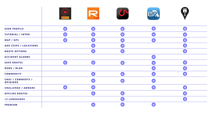
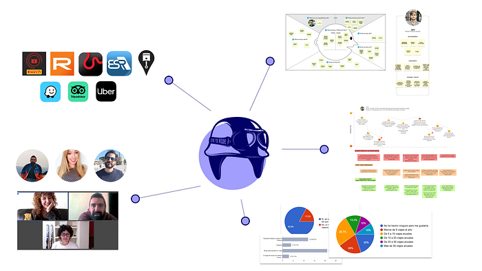
Firstly, my colleague and I decided to check the current market alternatives. We chose the most downloaded apps considering the user reviews. A few of selected applications were visually and functionally analyzed: Pirelli, Rever Moto GPS, Calimoto, ESR, Riser (Direct competence), Waze & Uber (GPS&Map integration), Tripadvisor (Community and review system).
This tab shows a functionality comparative between our direct and indirect digital competence:
After this exploration, we had to empathize with the user. For this reason, three tasks were resolved obtaining qualitative information:
User persona: We created some fictional characters (Tato, Carlota, Luis) based on our preconceived ideas about demographic users characteristics, common behaviour, needs and goals . This tool facilities the creation of a target segmentation and a first real user contact. How could we connect with our ideal customers?
Empathy Map:
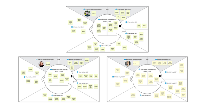
What do users say, think, do and feel? In order to understand our users’s perception and the problems that they are experiencing, this workshop activity helped us to get into their minds.
Proto Journey:
Tato: I can not connect with users located in other countries.
I would like to find mechanics, oil stations, restaurants and hotels on the map
Carlota: I don’t feel comfortable joining in a route with people that I don’t know
Luis: I’m willing to share my routes and experiences on a rider’s community
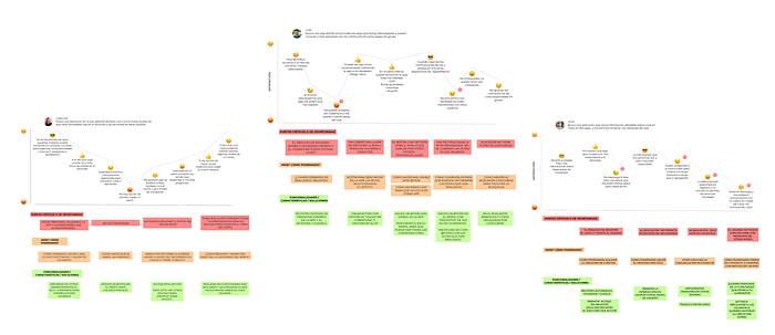
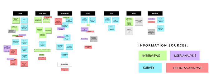
The survey and the personal interviews gave us quantitative and relevant pieces of information. We organized the results through an Affinity Map. This exercise is commonly used to cluster and segment the data analysis. What information matches and is reiterative? The diagram remark and classify the results, discovering patterns and categories.
We had to find information about: the real need to integrate a Map/GPS, community vision and willingness to share, general content, user profile requirements, premium/paid functionalities acceptance or common search habits when users program their journeys.
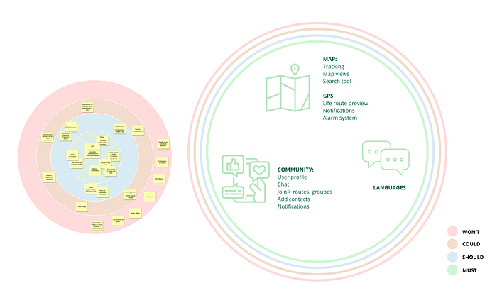
Finally, we defined our Minimum Viable Product keeping in mind business capabilities. What functionalities are a must, could be integrated or won’t be considered? The Core Model was the proper exercise through which specify if the pondered functionalities are essential or expendable, in order to resolve our users’s problems.
IA: Information Architecture
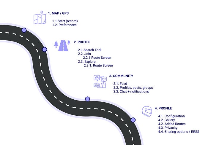
This discipline helps UX/UI designers to define a flow which lets users find the information easily. I really like this step because It allows to think about a logical structure of navigation and reduce the possibilities of frustration when users interact with a digital product.
Four main contain blocks were defined in this case of study: Map/GPS, Routes, Community and Profile.
Brand Stylescape:
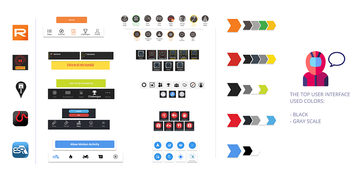
One of the followed steps in our previous research was the Market Environment Analysis.We found visual similarities between the digital products like the use of color palette.
We decide to keep the black and gray scale in order to establish legibility and elegance sensations, and replaced the highlighted red color. It was necessary to show differences and unliked our brand image to the race teams imaginary.
This document includes the design elements that make up the visual harmony. To think about bottoms, typography, icons and photographies behaviour is always a must.

Wireframes:

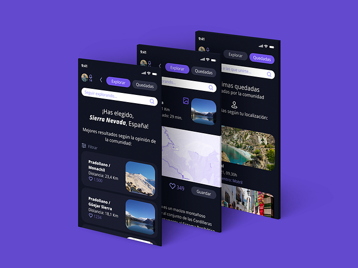
Prototype Hi-Fi:
Next steps: